Now my Sweetheart will be the first to tell you that I am not good with change. However, I do not think that it is true that I am scared of change. As proof, I admit that when Facebook changed from the original format a FB group started that said if the group got a million people to join their group, then Facebook would revert back to the original format. I never even thought about joining the group.
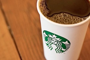
Now, there are new FB groups starting up because for their 40th birthday, Starbucks is (gasp) changing their logo. And the new logo is…

Notice something missing? Yeah, that’s right; words are missing. There is nothing saying “Starbucks” or “coffee.” The new logo is part of the “rebranding” of Starbucks.
People are outraged by this change! There are literally thousands of people joining protest groups because Starbucks dares to change their logo.
Do you care what the Starbucks logo looks like? Of course some people don’t care the least for Starbucks to begin with (I pity the fool). But does the change in the logo make the least bit of difference to you? Would you NOT buy Starbucks because of the new logo?
Thoughts?
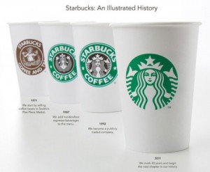
For those who care, here is the evolution that the Starbucks logo has undergone;

Comments
3 responses to “Starbucks 40th Birthday Gift; A New Logo and a Customer Uproar”
Makes no difference to the product inside their cups. However, anything is better than the original logo!
http://upload.wikimedia.org/wikipedia/en/e/e9/Sbux_logo_pre_1987.gif
I saw the sculpture at the Metropolitan Museum of Modern Art after which the Starbucks logo is fashioned. Cultural appropriation for capitalist gain does not seem to have changed. What’s the fuss?
I have updated this post to show the Starbucks logo evolution.